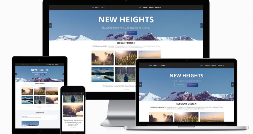
Never worry about how your website will look like on the iPhone or the iPad – it’ll simply be gorgeous.
Combining responsive web design with the latest in web technologies – HTML5, CSS3, jQuery, to name a few – Franz Josef fully leverages the latest capabilities of modern browsers and mobile devices to bring your audience stunning presentation every time, no matter the device.
Vector icons and high-resolution image assets bring clarity to your website. Say goodbye to blurry icons and images on retina devices – with Franz Josef text and lines are always razor-sharp, images are always crisp, no matter how high resolution your device screen is. For older devices with lower screen resolution, the theme intelligently instructs the browser to only download the lower resolution images, saving both precious data and shaving seconds off loading time.
With Franz Josef, you’ll want to have every device available just so that you can show it off.


The stream—that great glut of ideas, opinions, updates, and ephemera that pours through us every day—is the dominant way we organize content. It makes sense; the stream’s popularity springs from the days of the early social web, when a huge number of users posted all types of content on unpredictable schedules.
But we haven’t yet developed patterns for slowing down on the web. In some ways, access is simpler. Thoughts?
The most straightforward thing to do is to look through past content and identify what’s outdated: pieces you’ve written, projects you worked on, things you like. The goal is triage: sorting things into what needs attention and what’s still fine.